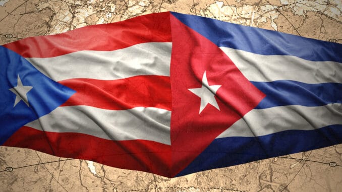
The national flags of Cuba and Puerto Rico are very similar. Both feature a combination of stripes and a triangle containing a star, and they share a similar color scheme. But have you ever wondered why this is so?
In this article, we will dive into the history of both flags. We will discuss how a shared interest in taking down the Spanish Empire in a fight for independence led to an unofficial partnership, including the adoption of similar, yet different, national flags.
The Cuban Flag

The national flag of Cuba features five alternating stripes. The three blue stripes represent the three departments, or military regions, that were present at the time. The two white bands represent purity, light, and the loyalist cause.
The flag includes a red equilateral triangle along the hoist side, a symbol which dates to the French Revolution and represents strength, constancy, equality, fraternity, and livery. The triangle may also have some Masonic origins. Inside the triangle is a white star, representing independence.
Cuba officially adopted the flag on May 20, 1902, and named it “The Estrella Solitaria,” or The Star Flag. Miguel Teurbe Tolón, a Cuban revolutionary and exile living in New York City, and a poet named Narciso López designed the flag in 1849.
Tolón carried the Cuban flag during a failed coup in 1850 and hoisted it for the first time after the city of Cardenas was taken by Cuban rebels that same year.
The Puerto Rican Flag

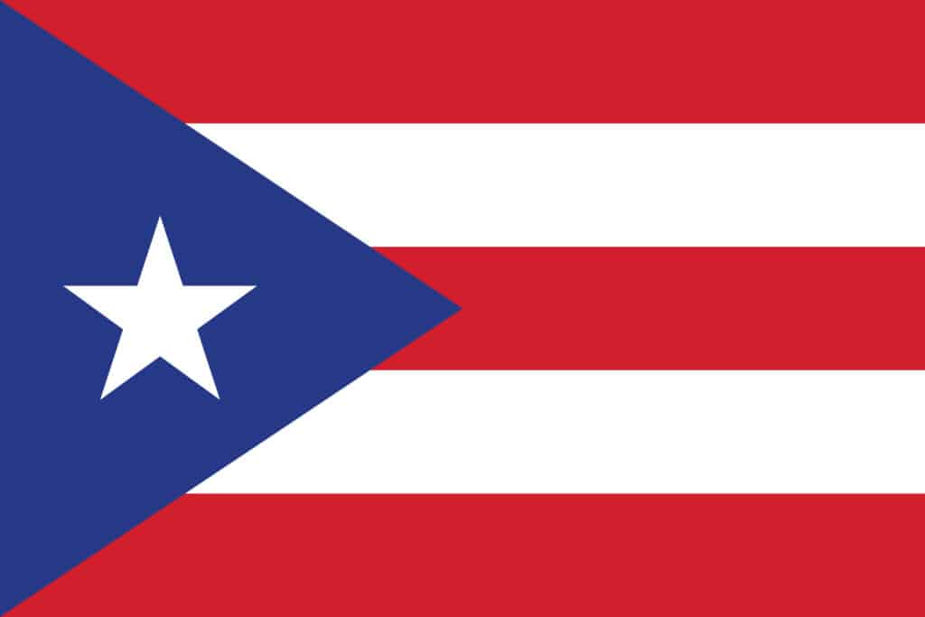
The flag of the Commonwealth of Puerto Rico is a mirror image of the Cuban flag, except with the colors inverted. The flag consists of alternating horizontal stripes, similar to the Cuban flag, except featuring three red and two white stripes. The triangle along the hoist side is blue instead of red and includes the same white star in the middle.
The three red stripes on the Puerto Rican flag represent the bloodshed that nourishes the three branches of government. The two white stripes represent liberty and the individual rights of man; The blue triangle represents the sky and ocean; The white star represents the Commonwealth itself.
It is not uncommon for the Puerto Rican flag to feature different shades of blue. Some say the true shade is a dark Navy blue – meant to match the shade of blue used in the flag of the United States of America.
However, many Puerto Ricans feel the original, lighter blue shade represents the correct design and that the darker shade was adopted after the U.S. gained possession of the island.
Why Are the Cuban and Puerto Rican Flags Alike?
The Puerto Rican Revolutionary Committee unveiled the current flag during a meeting in New York City in 1892. The committee originally used The Lares Revolutionary flag, named after a short-lived rebellion against the Spanish crown known as “El Grito De Lares.”
The independence movement designed The Lares Flag to reflect a plan for uniting the three Caribbean islands.
The current flag’s design is credited to Francisco Gonsalo Marín but is also attributed to several members of the Puerto Rican Revolutionary Committee. A letter written by Juan de Mata Terreforte names Marín as having provided the inspiration for modeling the flag after the current Cuban flag.
Other legends tell a different story involving Antonio Vélez Alvarado, another exiled revolutionary living in New York. According to the story, Alvarado was staring at the Cuban flag for several minutes before looking away toward the white wall nearby. This created an optical illusion of the flag with inverted colors on the blank wall, thus inspiring Alvarado to use the design for a new flag.
Yet another story attributes the flag’s design to the father of Maria Manuela (Mima) Besosa, who claimed to have sewn the flag. The flag was officially adopted by the Commonwealth of Puerto Rico in 1952, after having been outlawed since the U.S. took possession of Puerto Rico in 1898.
Conclusion
Regardless of who the original designer was, the Puerto Rican flag was designed by a group of revolutionaries as a symbol of the rebellion against Spanish rule. The same is true of the Cuban flag, which was created for a similar reason. The decision to adopt a similar design, albeit with inverted colors, was likely meant to convey a message of solidarity in the fight for independence.
